Firstly, a landing page is totally different from a home page. To make things clearer, a landing page is a page that someone “lands” on right after clicking on one of your ads. Similarly, a landing page serves a specific purpose, typically promotes a specific product or service, and has a clear Call-To-Action. On the other hand, a homepage is the starting point to the rest of the site’s content. In other words, a homepage typically serves many purposes and includes navigation to other website pages. Basically, there are two kinds of landing pages: microsites and standalone landing pages.
A microsite landing page is a small or condensed website usually created as a supplement to the main website. It is usually focused on one product or service line as opposed to all the products or services offered by the business.
Another is a Standalone landing page include; Click Through, Lead Capture, Lead Gen, and Squeeze Pages.
This guide from Highmark Digital is written for anybody who is searching for ways to improve landing page strategies.
To start off, a landing page has a sole purpose --- to gain sales or to keep the potential customer glued to your site until he/she decides to subscribe to your mailing list or purchase your product/service. So how do you achieve that goal? I’ve got one answer for you!
Start optimizing your landing pages.
By definition, landing page optimization (LPO) promotes lower customer acquisition costs while achieving a higher acquisition rate and maximizing the value of your ad spend.
To get you started with this topic, why don’t we start talking about the DON'TS of LPO.

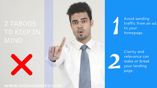
NEVER SEND TRAFFIC FROM AN AD TO YOUR HOMEPAGE
That’s right! Don’t waste your money by sending traffic from an ad to the home page. It’s a big NO-NO. Why not focus on the single-goal landing page for your promotional campaigns? This is much more effective than bombarding your visitors with far too many questions right at the outset.
"CLARITY" AND "RELEVANCE" CAN MAKE OR BREAK YOUR LANDING PAGE.
Never ignore the clarity of purpose as well as the relevant content of your landing page. When you overlook these factors, visitors are most likely going to leave the site confused, dissatisfied or annoyed. Every ad holds a purpose. So make it count. Hence, help your visitors find exactly what they are looking for. You must be able to answer the questions running on their mind in a split second.
What questions are we talking about? Here:
Furthermore, having good lead magnets (i.e. free trials) in return when you need them to share their email addresses is a good technique.
So how to build one? Read on if you want to learn more!
1. Open with a benefit-oriented headline.
To begin with, your headline should be attention-grabbing. This section is your top priority because this is where you create that “first impression” for your visitors. Certainly, if the headline isn’t that attractive, visually and content-related itself, then the rest of the site will likely be ignored.
2. Write clear, relevant, and concise copy.
Next, your copy should be reasonably short but must be enough to educate your readers about your product or service. A bulleted list of the needed information never fails.
3. Focus on getting visitors to take one specific action.
Then, if you want your visitors to get a free trial or subscribe to your newsletter, make that as the only button available on the page. As a result, this would enable them to focus on that button alone.
4. Remove all extra clutter—links, menus, buttons—that have nothing to do with the particular ad or campaign.
Moving on, do the previous step (No.3) without any other distracting options that might potentially sidetrack the visitors or might discourage them further. To cut it short, make everything as simple as possible.
5. Make the form or checkout option prominent.
Now, make use of bigger font sizes or better yet, display a good lead magnet (a discount offer or free trial) to lure them into clicking the checkout button.
6. Maintain your brand.
Finally, the overall look of your landing page design must be consistent. This is to make sure visitors immediately identify and associate what they see with your brand. What we’re trying to say is, you should use the same color hues and other design elements from your homepage to your landing page.
In this section, let’s discuss the 5 planning stages of a landing page before handing them over to your designer.
1. Identify your audience.
Initially, if you want to boost your conversion rate, you must first know your targeted audience. How? You can identify them by doing surveys or interviews. In this way, it would be easier to carve out your other plans because you already know the profile of your targeted audience.
2. Define your most-wanted action (MWA)
What does MWA mean? For everybody's knowledge, this pertains to the one action visitors should take when they are on the landing page. Particularly, this action is really all up to your product and approach. Pretty sure, if you’re selling a quite expensive product/service, it is best to collect contact information first (email perhaps) and cultivate the relationship right then and there. However, if you’re offering something that’s generally affordable and uncomplicated, you can go ahead and sell it directly perhaps. But if it’s technology-based, you can do free trials first.
3. Define your message.
So, you’ve got all the basics. Primarily, you now know who you are advertising for and which solution to offer. At this point, it is time to draft your message. Likewise, these are the words you put into the page. Hence, keep it simple and easy to understand.
4. Design your landing page.
Moving onto the visuals. Straight away, sketch it all out on paper or anny editing tool. Yet, don’t overdo this. Because if you do, only fewer visitors will fill out the form if you’re asking for too much information. Besides you’ve put too much navigation on your page, this would utterly confuse visitors as a consequence. Nevertheless, if you keep a streamlined process, you have higher chances of getting the forms filled out.
5. Put it all together.
It's just like building your whole lego house. You’ve got all the needed blocks in your hands and all you have to do is fuse them all together to make a solid lego structure. In the same manner, all the steps are presented to you, all you have to do now is connect all the dots. The correct message, the visuals and the preview are all done. At long last, launch it on the web!
Step #4 can be challenging for some, as designing is not everybody’s forte.
To back you up, here are the most important characteristics an Optimized Landing Page should have:
[/av_textblock]
[/av_one_full]
[av_one_full first min_height='' vertical_alignment='' space='' custom_margin='' margin='0px' padding='0px' border='' border_color='' radius='0px' background_color='' src='' background_position='top left' background_repeat='no-repeat' animation='' mobile_breaking='' mobile_display='']
[av_textblock size='' font_color='' color='' av-medium-font-size='' av-small-font-size='' av-mini-font-size='' admin_preview_bg='']
Even more, if a landing page only has very few components, each part should be carefully built.
Why you should dedicate time for testing
Testing your landing pages are important!
Definitely, it's not going to be a walk in the park, but it’s all worth it.
You have to spend a significant amount of time determining discrepancies on your landing page, at the same time, think of a better and more effective alternative.
Naturally, there are three kinds of landing page testing that you can do.
You can do Split Test first, then A/B test, and lastly Multivariate Test.
A piece of advice about testing: Experiment with as many variables as possible and as often as you can to ensure the final version you’re offering is optimized for maximum returns.
Let’s try to evaluate a couple of Landing Pages on the internet and see what we can do better.
PROS
1. Services are summarized in bullet forms.
2. A sample report is offered before purchasing.
3. Less navigation links.
4. Friendly looking mascot for added fun.
5. Company Logo is displayed.
PROPOSED IMPROVEMENTS
1. Headline needs more emphasis. (e.g. Bigger font size, use a more catchy phrase)
2. Looks highly technical for an average visitor.
3. Bottom texts are too small to be read.
PROS
1. Call to action is prominent.
2. Clear branding.
3. Headline is simple but hits the bullseye.
PROPOSED IMPROVEMENTS
1. Add an image product.
2. Get Started can be ambiguous. Use a more specific one. (e.g. Free Trial, Sales call etc.)
3. Put a summarized description of the product in bullet forms.
It’s not always enough that a visitor subscribes to your offer or email. It doesn’t end there. The ultimate goal is to fully convert these subscribers to actual purchasers. It’s not a guarantee that subscribers would even stay active after signing up forms.
However, what’s important is getting them started where they should be -- their willingness to share their contact information. That’s already a good start. And when you top it all off with some helpful optimization tips, you are more likely to have higher chances of conversion rates and increased sales prospects.
This is why you should pay attention to building your landing pages and we hope that this article helped you enlighten some of the most important components of an effective landing page.
A high-quality landing page that will convert leads has several major components that are similar to what you would see on a web page.
So take note of these tips and go build a page that is specifically designed to receive and convert traffic from your online marketing campaign.